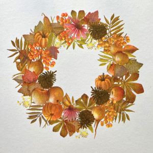
This Riso print was created by mixing 4 colors: yellow, blue, pink, and burgundy. And when I say ‚mixing,‘ I mean literally mixing, because risography works by preparing the artwork in layers, one color equals one layer. This means the artist must prepare each layer so that when they overlap, they achieve the desired color tone, intensity, and level of detail. It was my first experience with risography, and I have to say, it was pure alchemy!
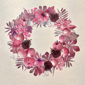
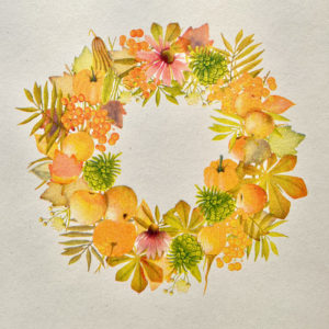
By leaving out the burgundy, I created the ‚VIVID Lime‚ version with and without yellow the ‚VIVID Burgundy‚ version.
Toto riso vzniklo spojením 4 farieb, žltej, modrej, ružovej a burgundy. A ak hovorím namiešať, myslím tým doslova namiešať, pretože risografia funguje tak, že podklad sa pripravuje vo vrstvách, jedna farba = jedna vrstva. Autor teda musí vrstvy podkladu pripraviť tak, aby ak sa prekryjú, docielil požadovaný farebný tón, intenzitu a mieru detailu. Bola to moja prvá skúsenosť s risografiou a bola to teda riadna alchýmia:)
Vynechaním burgundy vznikla verzia „VIVD lime“ v vynechaním žltej a vznikla „VIVID burgundy“.